
To avoid crying over Kubernetes failures: Troubleshooting flow leveraging Observability - vol.1
Have you ever had a problem using Kubernetes but don't know how to identify the cause? Because container-based systems can easily be micro-serviced, the number of components and services is much larger than in conventional systems. This also makes it more difficult to determine the cause of any failures.
So, for those who say, "I know I can get a lot of data with Observability, but I don't know where to start looking," I would like to introduce the "Troubleshooting Flow," troubleshooting guidelines for the cloud-native architecture implemented in Kubernetes.
The three signals of Observability (metrics, logs, and traces) introduced in the previous article are utilized in the troubleshooting flow.
*Please refer to the previous article,"What is Observability?"; The three signals (metrics, logs, and traces) as its components and the points to consider are explained.
Troubleshooting difficulties in cloud native and Kubernetes
Even though the system is cloud-native, the failures that occur are the same as in the past including the following performance issues, HTTP errors, and component failures.
- Performance problem
- Service delay
- Server failure (HTTP error 503 or 504)
- Component failures
- Pod and node failures and deployment errors
- Various middleware and application errors
However, a different approach is needed for "troubleshooting" to identify correctly and quickly where in the distributed system these problems are occurring and what the root causes are.
In the past, since it was easy to narrow down the servers (just look at the metrics and logs), analysis of "what is happening on the servers" was often the area of focus. For example, "isolate whether the cause is the AP server or the DB server by looking at the status of DB (database) slow queries," or if the AP (application) server is suspicious, isolate the CPU bottleneck and focus on profiling and GC (Garbage Collection) analysis.
However, since many components operate in a distributed and autonomous manner in a cloud-native architecture, the number of components and services is much larger than in traditional systems, making it difficult to get to the component in question by simply looking at a single metric or log.
In addition, with shorter component life cycles, persistence of information such as metrics and logs must also be considered. For example, it is difficult to quickly identify a pod that is related to service delays from a large number of pods. Often, even when a problematic pod is found, it is repeatedly restarted and no logs are kept.
Observability, introduced in the previous section, can be used to correctly identify components and events while retaining the information necessary for troubleshooting.
Overall Cloud Native Troubleshooting Flow
Let's look at the troubleshooting flow for cloud natives. Here is the overall flow. The flow itself is created starting from the point where a problem is detected based on response times and error rates (so-called RED metrics) obtained from external and service monitoring. Since the overall picture is quite large, we will divide it into three layers. If you look back at this diagram again when you finish reading this paper, it will be easier to grasp the big picture.
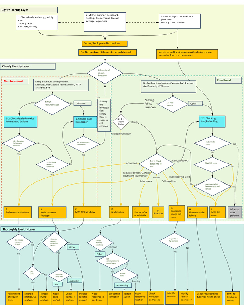
Overall Cloud Native Troubleshooting Flow
In the flow created this time, troubleshooting is divided into the three layers (Lightly Identify Layer, Closely Identify Layer, and Thoroughly Identify Layer) shown in the color-coded diagram above. The reason for this is that by gradually narrowing down the suspected problem, the scope of checking detailed information can be narrowed and the cause of the problem can be quickly identified.
Here is an overview of how each layer is separated.
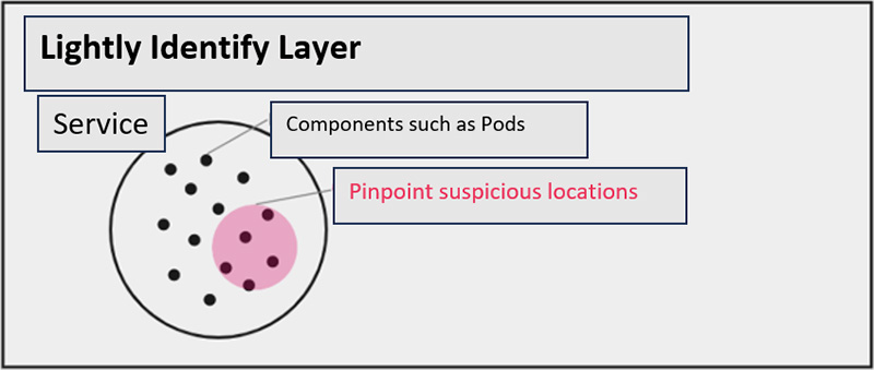
Lightly Identify Layer(Bonyari Layer in Japanese)
In the first "Lightly Identify Layer," we look at the dashboard and "lightly understand" the problem. We start at a stage where we don't yet know where the problem is occurring or what is happening, and then we narrow down the problem to a higher level than a Kubernetes Namespace.
In this phase, do not pursue each individual event too deeply, but only "guess" at what areas are likely to be suspicious.
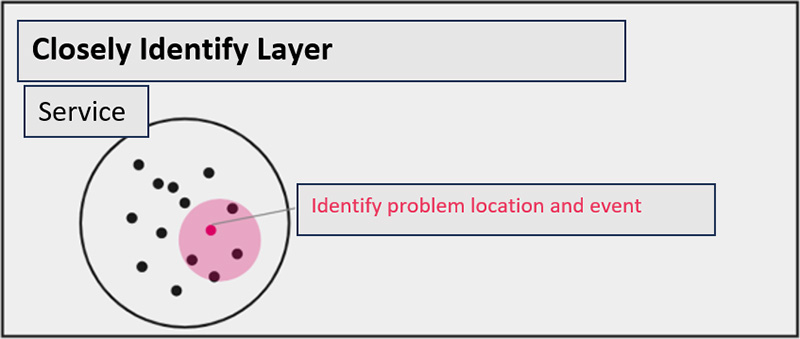
Closely Identify Layer(Shikkari Layer in Japanese)
In the "Closely Identify Layer", we further "narrow down" the problem from the suspicious areas that were lightly identified in the previous layer. This layer focuses on more detailed component-level problem locations (e.g., Pod or Node settings, CPU, memory, or other resources causing the problem), aiming for a more accurate understanding of the full scope of the problem event.
In this phase, the three signals of Observability are fully utilized. How to utilize and isolate the three signals is the key.
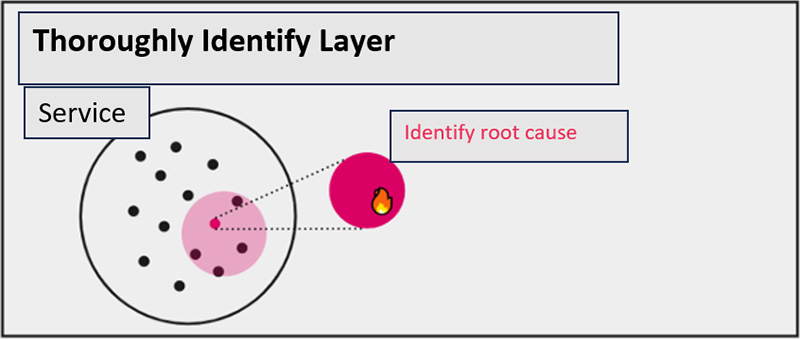
Thoroughly Identify Layer(Kacchiri Layer in Japanese)
Finally, we have a "Thoroughly Identify Layer" performa "root cause deep dive" into the problems occurring at the identified problem locations. The root cause is identified by analyzing detailed information (resource definitions, debugging, profiles, etc.) on the component where the problem occurs.
In this phase, we will look at the detailed information that should be confirmed for each problem. It is important to be specific about what information should be confirmed.
From here, we will introduce specific isolation flows, information to check, and tips for each layer.
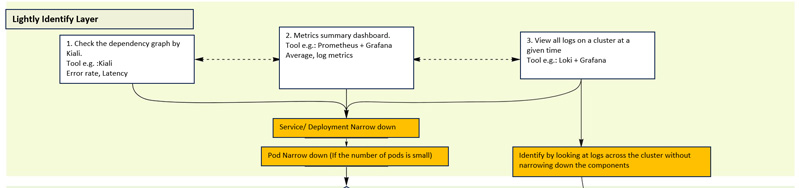
Lightly Identify Layer
The "Lightly Identify Layer" uses three different or combined investigation methods to narrow down the suspicious areas to the service, deployment, and pod levels.
This layer allows us to "guess" what areas are likely to be suspicious, so that we can make a forecast and plan for troubleshooting, and to estimate the scope of the impact.
The key is not going too deeply into them. Try to complete this layer as quickly as possible and ensure that future response plans can be considered quickly.
Lightly Identify Layer
Each of the three types of investigation methods will be described.
i. Check dependency graph in Kiali
The open source software (OSS) called "Kiali" can be used to visually identify problem locations using a dependency graph among distributed services.
For example, as shown in the figure below, it is possible to display services and pods with errors in red, and call latency between services can be overlaid on the graph.
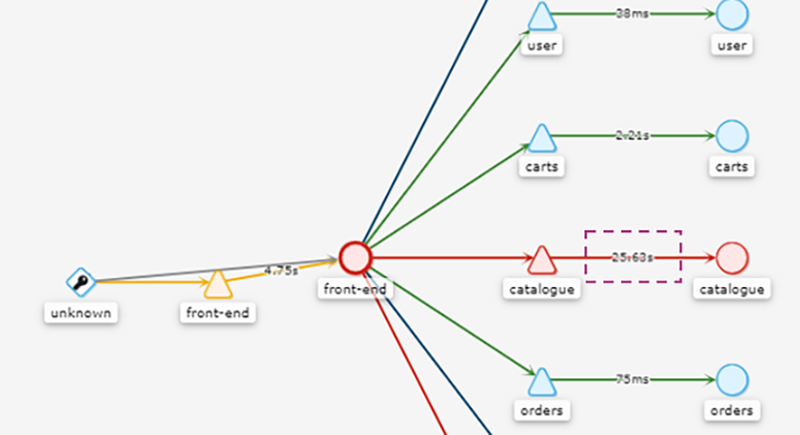
Dependency graphs among distributed services by Kiali
*For more information on Kiali's dependency graph (Topology), please see the Documentation.
This makes it possible to identify at a glance where the problem is occurring. However, it is difficult to analyze what kind of error is occurring (information beyond the HTTP error code) and why the delay is occurring with only this information, so use the subsequent "Closely identify layer" to proceed with the understanding of the event.
ii. Check metrics summary dashboard
To visualize the kind of information seen in Kiali, a mechanism* is needed to collect latency and request/error counts for each service. The reality is that this kind of information is not always available in rich detail. In such cases, starting the investigation with resource metrics, which are less expensive to collect, can be effective when Observability signals are not fully collected.
*Implementation of the application library in all services, using the service mesh and collect via "Envoy", etc.
In this method, you basically prepare a dashboard of metrics in advance and use that dashboard to identify suspicious service, deployment, pod, and other components. Therefore, it is important to summarize the information of Kubernetes clusters and Namespaces on the dashboard.
The standard OSS available for metrics are collection/storage with "Prometheus" and visualization/dashboarding with "Grafana". For example, the following should be devised.
- Prepare graphs that display metrics aggregated by service or deployment with averages and percentiles.
- Prepare graphs displaying metrics that count the number of errors output to the access log and application log. For example, the "Promtail" function of the log aggregation OSS "Loki" allows log aggregation metrics to be sent during log collection ( Ref. )
- Organize and design the information to be displayed on the dashboard in advance (see details in " Column Dashboard Design for more information).
Column: dashboard design
This column provides an example of dashboard design in a visualization tool.
Dashboards are a useful feature, but indiscriminately including all information in a single dashboard can result in a complicated dashboard to reference. This section provides some hints on how dashboards should be categorized and for what purpose.
Visualization tools and dashboards
Tools to visualize collected monitoring information such as metrics, logs, and traces include the following.
- OSS: "Grafana", "Kibana", etc.
- Public cloud: "AWS CloudWatch", "Cloud Monitoring" (Google Cloud), "Azure Monitor" (Microsoft Azure), etc.
- SaaS: "Datadog", "New Relic", etc.
Although each tool has different graphs and display formats, they all have the concept of a "dashboard". Dashboards allow users to view frequently viewed information in one place.
An example of dashboard design
If the dashboard is designed with a focus on the structure of the organization that develops and operates the system, the SLA (Service Level Agreement), SLO (Service Level Objective), and error budget of the service, it will be easier to capture the impact from the user perspective so, this will make it easier for each team to manage the system autonomously.
This is just one of the cases, but for example, a dashboard can be divided and created from the following three perspectives:
- Create a board to check SLAs, SLOs, and error budgets and check them daily.
- Predefined indicators for resource expansion planning and regular checks.
- Create separate boards for detailed information to be referenced in the context of each app and infrastructure team.
1 is the most important dashboard needed to quickly recognize the user impact of the service. It should be always accessible to everyone involved in the development and operation of the service. In a multi-tenant environment, you also want a dashboard that allows you to see all tenants at once. For on-site operations, a large monitor is often placed and always displayed. If the operation system is based on telework, it is a good idea to make sure that the on-call member always has the dashboard open during his/her shift so that he/she can quickly check it at any time.
2 is a dashboard for periodic review of information that needs to be foreseen before alerts are issued. It is used to monitor resource growth trends from a mid- to long-term perspective and to help resource owners plan for expansion. Ideally, a minimum number of indicators should be checked monthly or quarterly, but if the service is in the early stages of operation, it may be better to prepare a separate dashboard to check resources at a more detailed level and frequency.
3 is a dashboard positioned as a "detail view" that only individual team members can refer to. If the team is developing and operating an application, information that should be displayed on the dashboard may refer to "4 Golden Signals," "RED method," and so on. For infrastructure, the "USE method" is well known. The RED/USE method was introduced in the previous article for more information.
Key points when designing dashboards
This column concludes with some points that are important when considering the configuration of a dashboard.
- Clarify dashboard management policies and owners.
- Display SLAs, SLOs, and error budgets on a dashboard to quickly understand user impact.
- The dashboard will be brushed up from time to time as the application and infrastructure develop.
Different services have different organizational structures for their operations. There is no one right answer, so we need to find the right dashboard structure through trial and error.
iii. View all logs on the cluster in the relevant time period
A different "Lightly Identify Layer" investigation method is to look at the logs generated by the cluster and let the cluster identify the problem. If an error of some kind is found, the area around the component that is causing the error is suspect, so the problem can be identified quickly in situations where the number of components is not yet large.
Therefore, if the cause of the problem has been identified to an obvious error, such as an error specific to the application or middleware, proceed directly to "[2]-2 Confirmation of logs" in the "Closely Identify Layer".
On the other hand, if there is still insufficient information to identify the problem, such as "we have identified deployment and pods where multiple errors frequently occur, but there are multiple possible causes for these errors to occur," narrow down the suspect areas and proceed to "[0] Non-functional or functional, which is more likely?"
For example, by utilizing Loki, logs can be lightly filtered in the same way as "Grep" by means of labels assigned to each component, so that logs from multiple components on a cluster can be viewed cross-sectionally and efficiently.
In analyzing logs, it is important to also check cluster metrics and other information as necessary to efficiently identify events. This is because logs contain more information than metrics, and in some cases, it may take longer to identify events.
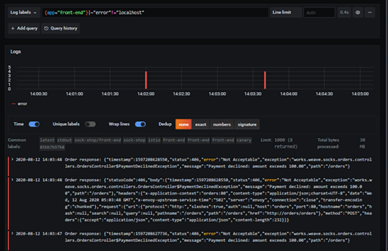
Check/search logs using Loki
Continue reading the second part
To avoid crying over Kubernetes failures Troubleshooting flow leveraging Observability-vol2Original Article
This article is a translation and adaptation of an April 2023 ITmedia@IT article Kubernetes障害で泣かないための羅針盤、Observabilityを活用したトラブルシューティングフロー大公開:Cloud Nativeチートシート(14) - @IT (itmedia.co.jp)

